Accessibility
One of the most important (and often overlooked) components of selecting good digital resources is to ensure that these resources are accessible to all students. In many districts, accessibility is an afterthought, and usually just thought simply as captioning videos. However, building and selecting tools that are accessible is a process that is intentional, involved, and complex. Accessibility needs come in many forms. When we think of accessibility, too often we think of screen readers and captioning. These are two incredibly important tools for accessibility. However, they are not the only ones. When we design for accessibility, we are designing Universally - for people who not only need screen readers or captioning, but for users with low vision, who are not native English speakers, who may be neurodiverse, who may have learning or reading disabilities, who may have cognitive impairments, who may have issues with motor planning and motor control, who may rely on keyboards or switches to operate a computer instead of a mouse, etc.
Requirements for Accessible Content
Legal Requirements
Section 508 of the Rehabilitation Act of 1973 requires that “Federal agencies to make their electronic and information technology (EIT) accessible to people with disabilities”. While this definition has not extended to federally-funded agencies yet, Section 504 of this act does require that any organization receiving federal funds shall not deny benefits or face discrimination in any program because of their disability (504 plans originate from this section which are plans to support students during a temporary disability). Additionally, Title II of the Americans with Disabilities Act, which “prohibits discrimination on the basis of disability by both public and private entities, whether or not they receive Federal financial assistance” and requires:
State legislatures and courts, town meetings, police and fire departments, motor vehicle licensing, employment services, and public transportation programs. State and local governments must operate their programs so that, when viewed in their entirety, they are readily accessible to and usable by people with disabilities. They must provide programs and services in an integrated setting, unless separate or different measures are necessary to ensure equal opportunity, and must eliminate unnecessary eligibility standards or rules that deny individuals with disabilities an equal opportunity to enjoy their programs or services. State and local governments must also make reasonable modifications in policies, practices, and procedures and provide effective communication through the use of auxiliary aids and services when necessary to ensure equal access for individuals with disabilities, unless an undue burden or fundamental alteration would result.
These are the laws that mandates things like handicap ramps and braille signs, but also includes websites, parental communications, and educational resources. Additionally, for schools, the Individuals With Disabilities Education Act (IDEA) requires that students receive services such as captioning and braille translation and assistive technology devices to ensure access to the Least Restrictive Environment. Educational technology tools and digital resources used in the classroom must be able to comply with all of these laws as well as a child’s IEP, or alternative arrangements must be made. Depending on the nature of the arrangements that need to be made, the tool or assignment must be altered for all students in the event that failure to do so routinely removes the student from the Least Restrictive Environment.
Other Obligations
Beyond the federal requirements, the constitution of the State of North Carolina requires that “a general and uniform system of free public schools shall be provided throughout the State, wherein equal opportunities shall be provided for all students, in accordance with the provisions of Article IX of the Constitution of North Carolina” and that “the people have a right to the privilege of education, and it is the duty of the State to guard and maintain that right.” Beyond the legal ramifications of designing or selecting inaccessible content, one could argue that as educators, we have a moral obligation that if we are to leverage the power of technology as a “great equalizer”, we are obligated to select and promote tools that can be accessed by all and to not use technology as a tool that furthers inequity within our education system and denies opportunities to certain students.
Failure to Comply
The Office of Civil Rights is charged with investigating claims of violation of any of these laws and schools failing to comply can be subject to civil lawsuits or sanctions. Numerous schools are slapped with lawsuits yearly for failure to create school and classroom websites with accessible content. Several years ago, the University of California at Berkeley released video lectures and course content free of charge. The course content was released through the edX MOOC platform and through iTunes-U. Because the videos weren’t captioned, the school faced a lawsuit over ADA violations. As a result of the time and expense to bring these videos into compliance, they removed all of their old content from the web. Some have argued that this robbed the majority of people with high-quality content based on the needs of a small audience, while others have argued that this audience was being denied access to these publicly-funded resources because of their disability.
Creating Accessible Content
As stated earlier, creating content which is accessible to all is a very intentional and very difficult process. Everything from content layout to font choice to word choice to the use of tools is subject to consideration.
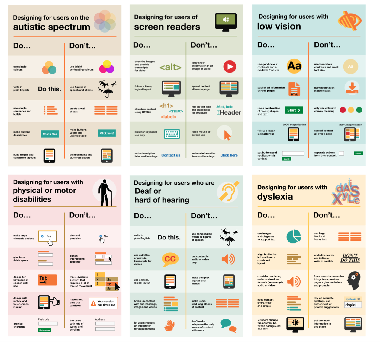
The UK accessibility office has put together a series of accessibility guideline posters and made them available on GitHub to support designers and content creators as they create content.
General Guidance
The WCAG 2.1 Guidelines are a starting point created by the World Wide Web Consortium to set standards for how content on the web should be formatted to be accessible. WCAG standards are divided into three levels based on the level of modification required to be compliant, ranging from “A” which is the least strict to “AAA” which is the most strict. All public sites in Europe are required to be AA-compliant, and that is a recommended best practice for sites in USA public schools also. While tailored to the web, some of the guidance in WCAG2.0-AA is generally recommended for all electronic media. The WebAIM project out of the Center for Persons with Disabilities at Utah State University has a thorough set of tutorials for creating accessible content. You should read the entire thing, but a few of the key points are listed below.
- Text should be left justified. If text needs to be right justified for visual reasons, that is acceptable as it is acceptable to center single lines of text. Do not full-justify text. Ensure adequate margins and spacing around and within text boxes and make fonts as large as is practical.
- Videos should be captioned in a time-synced way, meaning that the captions should follow along with the video. YouTube’s auto-captioning features is a good start, but it’s insufficient - captions should be accurate and should also include text descriptions of any audio cues that aren’t speech (such as background noise which is relevant to the video content).
- All links should be descriptive in nature. Screen readers are able to present users with a list of links on the page for easier navigation. While it’s tempting to use text like “click here” as a link, it doesn’t convey sufficient detail out of context. Therefore links should read something like “click here to access this file” or “Public School District Home”.
- A page should be able to be zoomed in with minimal loss of functionality and should be able to be navigated by keyboard so that users of switching devices in lieu of a mouse can navigate.
- All images should contain alternative text. The text should not convey the meaning of the image and not simply state what the image is. For example, your school logo should have alt text “XYZ School, Home of the Bulldogs” and not “School Logo”. For more information about alt text, check out this article from Moz on AltText and this primer on AltText from WebAIM.
- To that end, using text in images is discouraged since screen readers can’t parse it, and won’t be able to read the image.
- Avoid low-contrast backgrounds and text (think “black text on navy background”). WCAG recommends a contrast ratio of at least 4.5:1 for all media and 3:1 for any text larger than 18 point or bolded and 14 point. A contrast checker on the web can help with this - put in two HTML color codes and it will tell you if the contrast ratio is correct.
- Do not only use color to convey meaning in content and in visual elements. Use elements such as text, shape, and size to support the use of color in visual elements.
- Words that are unusual or are new abbreviations for words should be explicitly linked or explained inline. If pronunciation is critical to understanding a word, it should be included as well.
HTML and Webpage Design
Specific to webpages, you should use HTML5 semantic styling instead of relying on text formatting to convey meaning. Semantic styling refers to styling based on what the block contains instead of how ti should be styled. For example, when HTML was new, you would make text bold by using the
<bold>or<i>tags. In HTML 5, we use the<strong>tag for bold and the<em>for italics (emphasis) instead. These new tags do more than style the text, it coveys the meaning of the text. This allows devices which may be reading or formatting a site differently to convey both the way the text should be styled and the meaning of the style. This is useful for screen readers but also tools like Safari’s reader mode, which strips away unnecessary text and formatting to create a cleaner view for reading. ARIA Roles and Labels also provide context for users using assistive devices.
WebAIM has a WCAG checklist that it is a good idea to run through on webpages that you create or webapps that you are evaluating for purchase. They also have created the WAVE Browser Plugin which can be used in any web browser and will flag accessibility errors as an overlay on any webpage when the extension is clicked. While screen readers are not the only form of accessible design, we can see in videos like this how it goes wrong.
Within Bootstrap, there are a few built-in tools for accessibility. As you read the manual, you’ll notice that accessibility issues are flagged throughout. However, the .sr-only class can be used for specific items to flag additional information that will only be identified by assistive devices like screen readers. This is useful in many examples, including links that open in a new window. Based on WCAG guidelines, you should identify a link will be opening in a new user so that users aren’t confused when this happens. A best practice for screen readers is to include a note in the link text:
NC State University (Opens in a new window)
The “Opens in a new window” text would only appear to users of screen readers and other assistive devices. If you’re not using Bootstrap, you can recreate this using the following CSS. What this CSS does, effectively, is move the items in the .sr-only class very far off-screen into a 1px-by-1px block. Because screen readers read HTML in order, it will be read, but a user will not see it. Again, you only need to implement this if you are not using Bootstrap
.sr-only {
  position:absolute;
  left:-10000px;
  top:auto;
  width:1px;
  height:1px;
  overflow:hidden;
}
Additionally, Bootstrap has built-in support for focus states. In order to be WCAG 2.1 compliant, you must be able to navigate to all clickable elements on the page using the Tab key. A blue glow will show up by default in most browsers when an element is highlighted. You can use the :focus modifier in CSS to change the appearance of this focus state to make it more pronounced. For example, if I have a link, I can do the following my CSS (overdramatized for effect - it doesn’t need to actually be that pronounced):
a:focus{
  border: 5px solid blue;
}
Therefore, <a href="http://www.ncsu.edu">NC State University</a> would look like this (click and hold or use the tab key to see):
Microsoft Office and Google Docs
Both Microsoft Office and Google Docs include the ability to add alternative text to images. Also, while Microsoft and Google Docs both have the ability to use semantic styling to flag headers, captions, etc, most people change the text styling instead, creating an accessibility challenge. Semantic styling should be used wherever possible. Additionally, tables should be simple and avoid the use of merged cells. MS Office also has the ability to flag a row as a “header row” which improves accessibility.
Microsoft has a page with instructions for creating accessible documents and instructions on how to use the built-in accessibility checker for each app. Google Docs is far less accessible than Microsoft Office. Google Docs does have a page with best practices for accessibility, but the best bet for Google Docs is to use the free Grackle Docs plugin.
PDF Files
PDFs are notoriously difficult to make accessible. As a rule, any document scanned to a PDF is not accessible and there is no way to make it accessible except to transcribe the contents. Accessible documents exported through Microsoft Word or Grackle Docs are generally as accessible as a PDF can be. The use of PDF files on websites, especially scanned PDFs, is discouraged by the accessibility community.
Social Media
Social media posts commonly use images with text to convey meaning without supporting text. Social media posts should convey as much information as possible in text. Twitter also has support for image captions. Facebook has a full accessibility center, with information on how to caption images and upload video transcripts. You should also #camelCaseYourHashtags (capitalize the first letter of each word) to improve readability.
Evaluating Content
When conducting a technical evaluation of content, the above should be used as a starting point to determine accessibility. Vendors should also include an accessibility statement on their website (see this example from Padlet) or should be required to provide one upon request as a part of a contracting deal.
While vendors may provide accessibility statements on their website, the VPAT (Voluntary Product Accessibility Template) is made available to vendors to describe to what extent they conform to WCAG or Section 508 rules, and any caveats related to their compliance. Many vendors will have this evaluation completed by a third party.
Supporting Tools
Many operating systems and applications have built tools to support accessibility. Beyond the designs mentioned here, computers have many tools to support access, including speech-to-text, high contrast modes, etc. Eye trackers and switches can also be used for people with limited mobility to interact with their computers. Apple has put together an accessibility website with information about their accessibility tools and tutorials linked. Microsoft has made accessibility a corporate focus, and have included tools and games designed first for assistive technology along with an adaptive Xbox controller, and features in Microsoft office that can highlight individual lines of text or break words apart by syllables and highlighting parts of speech. Chromebooks have more limited accessibility features, but are sufficient for most use cases. All three platforms, as well as Microsoft Office and Google Docs, now support voice-to-text functionality for students.