Image Transformations and Backgrounds
Image Transformations
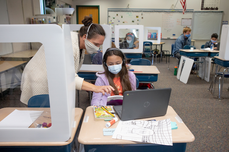
CSS provides a lot of different options for transforming an image. Let’s start with a base image, such as this one from the Deeper Learning in Action Photo Library.
CSS allows us several different options for photo styling. See examples below:
Rounded Borders
The border-radius attribute can be used to create a “circular image” effect. The value can be in pixels or percentages, depending on how round you want the image:
#image-round{
	border-radius: 50%;
}
Opacity and filters
The opacity attribute can be used to change the opacity of an image. filter has a list of different options that can be used to blur an image, change it to greyscale, sepia, blurred, etc.
#image-faded{
	opacity: 50%;
}
#image-sepia{
	filter: sepia(75%);
}
Rotations and Skews
The transform attribute can be used to translate, rotate, skew, or transform an image.
#image-rotate30{
	transform: rotate(30deg);
}
As you can see, the rotate command will allow the image to leave its box and overlap with other elements. The overflow attribute on the parent <div>/container can be used to hide the excess image:
#image-parent-container{
	overflow: hidden;
}
#image-rotate30{
	transform: rotate(30deg);
}
Backgrounds
Any container, from the entire page to a single div, can have a background. The background-color property accepts a color code and can be used to style any container.
#test-div{
	width: 200px;
	height: 200px;
	background-color: blue;
	margin: auto;
	color: white;
}

<div id="test-div">My Test Div</div>
You can also use a background image. The example below shows an image background with a text overlay. The background-image accepts a file name in parentheses, prefixed by url:
#toasters{
	background-image: url("flyingtoasters.jpg");
	height: 400px;
	width: 400px;
	font-size: 32px;
	color: white;
	text-align: center;
}

<div id="toasters">It's the 90s!</div>